From Fragmented Experiences to Unified Design Excellence

From Fragmented Experiences to Unified Design Excellence
End-to-end ownership across strategy, research, IA, design system, and delivery
OET (Occupational English Test) is an internationally recognised English language assessment for healthcare professionals seeking to work in English-speaking countries. Governed by CBLA (the Centre for Assessment of Language Competency), OET tests candidates across five language skills and is accepted by healthcare regulators in the UK, Australia, USA, New Zealand, Ireland, and beyond. The website is both a primary marketing surface and a functional platform — candidates use it to register for tests, find venues, access preparation resources, and manage their candidate journey. With over 300,000 test takers per year across multiple global markets, the digital experience directly affects revenue, brand credibility, and candidate outcomes.
Brought in to lead the end-to-end redesign of OET's global website — a platform serving 300,000+ healthcare test takers annually across the UK, USA, Australia, India, and the Philippines. My ownership spanned UX strategy, global user research, information architecture, design system build, delivery, and post-launch measurement. This was not a handoff role. I stayed accountable through every phase.
• Navigation architecture conflated four distinct user segments with fundamentally different needs and goals
• Accessibility gaps created barriers for users in key markets, particularly mobile-first audiences in India and the Philippines
• No self-service capability, candidates relied heavily on the support team for information that should have been findable in the UI
• Content was redundant, outdated, and missing in critical areas — identified through a full content audit with the marketing team
• The CMS (WordPress) couldn't support the modular, component-based architecture needed for scalability
• Search was inadequate: users couldn't find test dates, venues, or preparation resources without significant effort

I was the Senior UX Lead with end-to-end ownership of the UX strategy, research programme, information architecture, design system, and delivery process. This was not a handoff role, I remained responsible through post-launch measurement.
• Defined and owned the UX strategy document: scope, personas, accessibility goals, design principles, and KPI
• Stakeholder Alignment
Conducted initial discussions with leadership, marketing, and product teams to define project goals, timelines, and KPIs.
• Reviewing the current website analytics, design systems, and user feedback to identify key friction points and opportunities for uplift
• Mapping the digital experience vision to the transformation roadmap, ensuring design priorities directly support business goals such as self service, accessibility, and AI integration
• Establish UX Research & Design OpsPractices
• Led global user research — interviews, usability studies, card sorting, competitive analysis
• Designed the revised information architecture and navigation system
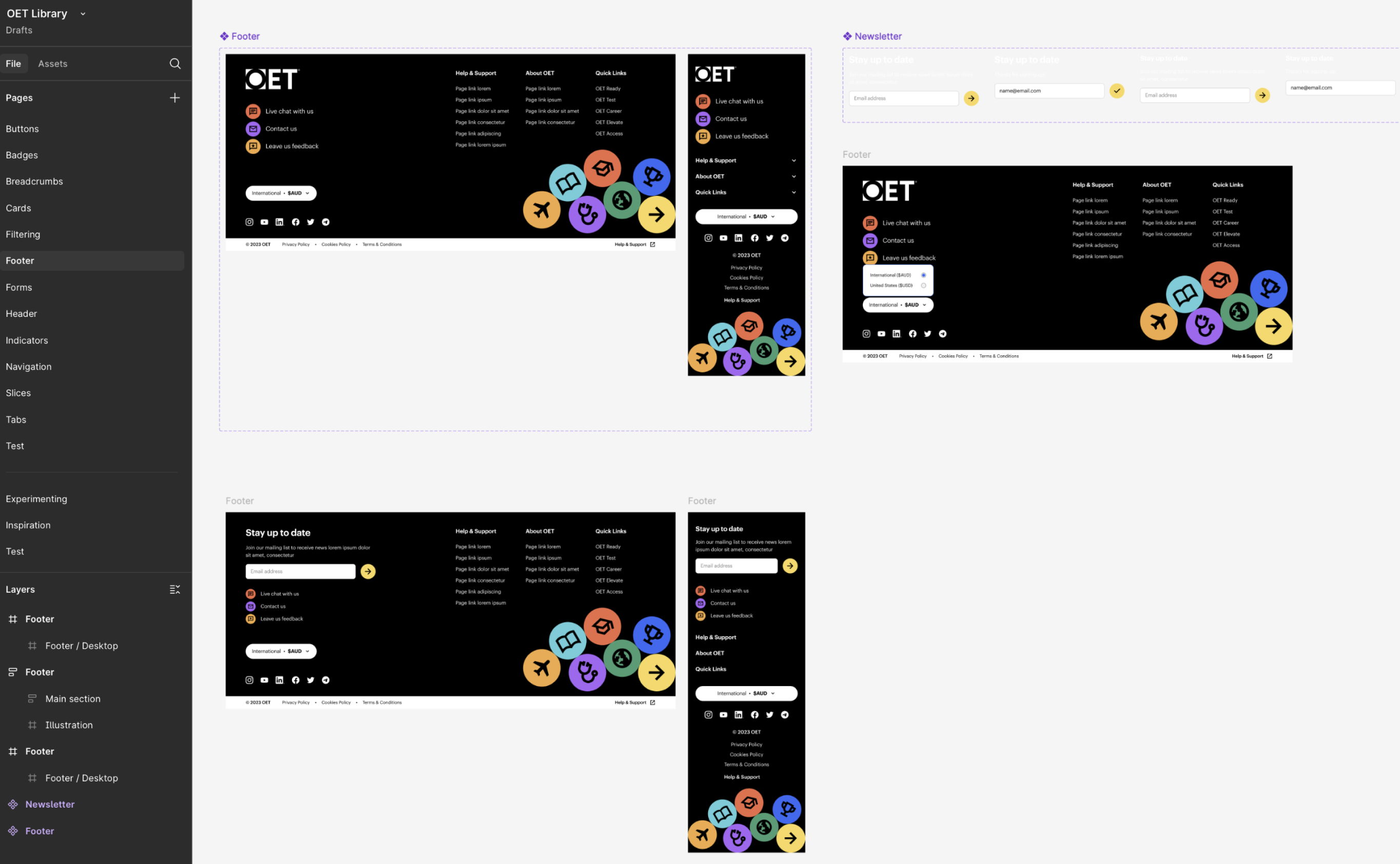
• Built the design system (Figma) including typography, colour, components, and WCAG 2.1 AA compliance
• Built and tested high-fidelity interactive prototypes through two rounds of usability testing
• Managed the CMS transition from WordPress to Agility CMS — defining the component-based content architecture
• Collaborated on Algolia Search integration and Commerce Layer headless commerce implementation
• Conducted design QA on staged builds before launch
• Established post-launch analytics dashboards and A/B testing cadence
The team and collaborators
• Design team: 4 UI/UX designers (I led and reviewed their work)
• Engineering: front-end and back-end development teams (internal)
• Product and marketing: joint stakeholders on roadmap prioritisation and content strategy
• Content team: collaborated on content audit, sitemap redesign, and CMS migration
• Research participants recruited via Askable across 5 countries
• Conducted fully in hybrid model, workshop facilitation both in-person and remote
1. Global scope with real market diversity: mobile-first users in Australia, New Zealand, USA, UAE, India and the Philippines required fundamentally different design decisions than desktop-primary UK users, this wasn't a localisation exercise, it was a genuine design constraint
2. Competitive environment: OET sits alongside IELTS, PTE, and TOEFL, design had to work as a differentiation tool, not just a functional platform
3. CMS migration ran in parallel with the redesign, design decisions had to be validated against what Agility CMS could actually build, constraining component architecture
4. WCAG 2.1 AA compliance was non-negotiable in regulated healthcare markets, not a stretch goal
5. Four genuinely different user segments with conflicting IA needs had to be resolved into a single coherent navigation system
6. The scope expanded during the project to include the Algolia search integration and Commerce Layer headless commerce ,requiring close collaboration with engineering to ensure UX continuity across these third-party systems


Phase 1 — UX Strategy and Stakeholder Alignment
Before any design work began, I established the strategic framework. I conducted alignment workshops with leadership, marketing, and product teams to define project goals, KPIs, and the design principles that would govern every decision. Deliverable: a UX strategy document covering project scope, user personas, accessibility goals, design principles, and the research plan. I also reviewed existing analytics, design artefacts, and VOC feedback to create a clear, evidenced baseline.
Phase 2 — Global Discovery and User Research
I led user research across five countries with all four user segments — structured interviews, usability studies on the existing website, and competitive analysis against IELTS, PTE, and TOEFL.
AI workflow note: I designed a structured tagging taxonomy in Dovetail before synthesis began, so findings were comparable across sessions and markets. Dovetail's AI clustering then surfaced patterns I could take directly into stakeholder presentations — cutting synthesis time from what would have been days of manual processing into a single working session. Miro AI accelerated affinity mapping in ideation workshops, enabling real-time clustering with cross-functional teams.
Phase 3 — Information Architecture Redesign
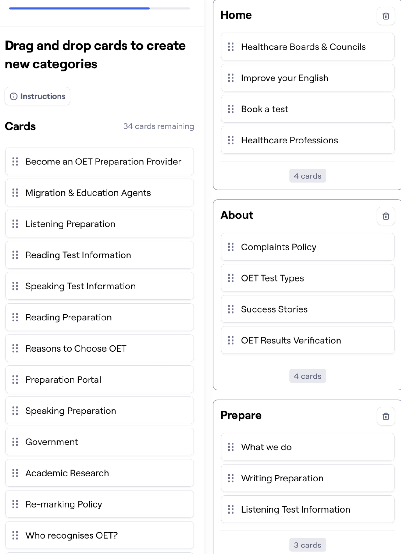
Using card sorting sessions (Optimal Workshop) with internal and external participants, I validated how each user segment mentally organised the content — and where the existing structure diverged from their mental models. I redesigned the sitemap from the ground up, creating distinct, intuitive pathways for each segment rather than a single generic structure. Deliverables: revised sitemap, content inventory, low-fidelity wireframes and user flows for all core interactions.
Phase 4 — Design System and Visual Design
I built a comprehensive design system in Figma: typography scale, colour palette, responsive grid, reusable components, motion principles, and interactive states. WCAG 2.1 AA compliance was built into every component — not retrofitted. I aligned the design system with Agility CMS's component model so what was designed could be built without compromise, and collaborated with developers throughout to ensure feasibility.
Phase 5 — Usability Testing (Two Rounds)
Round 1: Moderated and unmoderated testing with international users across all four segments using Maze. Identified navigation bottlenecks, content discoverability gaps, and mobile interaction friction specific to low-bandwidth users. Iterated on designs with primary focus on navigation clarity, accessibility, and registration flow simplification.
Round 2: Follow-up testing to validate improvements before handoff to development. Confirmed resolution of primary pain points and identified final refinements.
Phase 6 — Delivery, CMS Migration, and Post-Launch
Managed the WordPress to Agility CMS migration — defining the component-based content architecture that improved scalability and authoring efficiency. Integrated Algolia Search & Discovery to surface test dates, venues, and preparation resources accurately. Collaborated on Commerce Layer headless commerce integration. Conducted design QA on all staged builds before launch. Set up GA4, Hotjar, and Algolia analytics dashboards, and established an A/B testing cadence for CTAs, navigation menus, and content layouts.
Key Solutions Delivered:
Additional Enhancements:
Improved performance and load times for better user experience.
Lessons learned
• Designing for global markets is not the same as designing for multiple languages. Device constraints, bandwidth, trust signals, and content expectations vary by region in ways that only direct research surfaces, assumptions about what 'international users need' are almost always wrong.
• CMS architecture decisions belong in the design process, not after it. The Agility CMS component model shaped what was achievable, and the earlier we aligned design components with CMS components, the less rework we had at handoff.
• AI-assisted synthesis is most powerful when you design the workflow first. The tagging taxonomy I built in Dovetail was as important as the tool itself, without structure, AI synthesis produces noise.
• A/B testing post-launch is not optional on a site of this scale. The analytics dashboards I set up at launch created the feedback loop that made the continuous improvement programme possible.

OETs new Digital Platform and branding achieved significant improvements:
The combination of graphic design, branding, and Webflow’s flexibility resulted in a visually stunning and user-friendly platform that effectively communicates GreenLeaf Studio’s values.